Norah Lane – One of the boys
1. On a scale of 1 to 10 how much do you think that our music video compares to other Tween pop music videos? 1 being completely unlike tween pop music videos and 10 being very similar to tween pop music videos.
1 2 3 4 5 6 7 8 9 10
2. How do you think that Norah Lane compares to other Tween pop artists like Miley Cyrus and Taylor Swift?
1 2 3 4 5 6 7 8 9 10
3. Do you think that the storyline works well with the song?
Yes No
4. Do you feel like you can relate to the story in the storyline in some way?
Yes No
5. Do you think that the transformation was as good as the transformation in Taylor Swift’s video for you belong with me?
Yes No
If you answered no, why?
6. Do you think that the actors we use are suitable for their parts in their music video?
Yes No
If you answered no which of the characters do you think aren’t suitable for their part?
7. On a scale from 1to 10 how well do you think Norah Lane is represented in the music video?
1 2 3 4 5 6 7 8 9 10
9. Any Improvements that you think we need to make?
Norah Lane’s Website
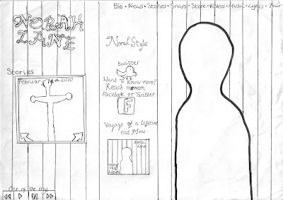
1. On a scale from 1 to 10 comparing it to similar Tween Pop artist websites, how much do you think that Norah’s website looks realistic?
1 2 3 4 5 6 7 8 9 10
2. Do you like the nautical theme for the website?
Yes No
3. Do you think that the nautical theme suits Norah’s personality from her music video?
Yes No
4. Do you think that the website is easy to understand and to navigate around?
Yes No
5. Did you find that there would be enough information about the artist for the fans looking at the hyperlinks and features available?
Yes No
If you answered no any suggestions?
6. Do you think that you would want to become a member of NorahStyle?
Yes No
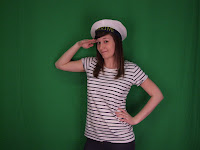
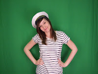
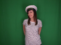
7. Do you think that the image we have used is appropriate for the website?
Yes No
8. Would this website appeal to you?
Yes No
9. Are there any improvements that you think we could make?
Norah Lane’s Album Cover
1. On a scale from 1 to 10 how much do you think Norah Lane’s album compares to other tween pop artists?
1 2 3 4 5 6 7 8 9 10
2. Do you think that it was a good idea that we used the same theme for both the Album cover and the website?
Yes No
3. Do you think that having Norah Lane wearing the same clothes on her album as she does on her website is a good addition?
Yes No
4. Do you think that the image for the back of the album goes well with the nautical theme?
Yes No
5. Looking at the presentation of the album would you buy it if you saw it in stores?
Yes No
6. Is the title of the album suitable?
Yes No
7. Looking at the song titles do they look like songs you would see on a tween pop album?
Yes No
8. Any improvements that we think that we could make?
9. Looking at Norah Lane’s music video, website and album cover do you think that Norah Lane is well represented through the themes, images, behaviors and personality?
Yes No
10. Is Norah Lane a tween pop artist that you would chose to follow?
Yes No
Why is this?
Results

Looking at the results our target audience thought that our music video looked more or less like other Tween pop music videos, with most people scoring it between 7 and 8. However people were still giving our video low scores meaning that it would need quite a bit of improvement.
 Another important result was that most of our target audience thought that Norah lane compares to other Tween pop stars like Miley Cyrus and Taylor Swift with nearly half of them scoring 9 and 10. This means that we were successful with how she was represented using the correct clothes and emotions, however, two people were negative about comparing Norah Lane to other these Tween pop artists. Everybody I asked believed that the storyline fits the music video but one of the vital conventions was that our audience would be able to relate to the story line in some way. When I asked whether my potential target audience would be able to relate to the story in our music video 14 out 25 said yes they could. However, when I asked whether the transformation in our music video is as good as the transformation in Taylor Swift’s video 16 out of the 25 people I asked said no.
  When I asked why this was most people said that there was more of a change in how Taylor Swift looks in her music video compared to Norah Lane. Other people said Taylor Swift’s video makes it look more professional and some said that it looked better because she turned up at prom. So to improve on our music video we would have to make the transformation scene more effective and professional looking by making more of a difference to how Norah Lane looks. On the other hand 20 out of 25 of the people that we asked thought that the actors were suitable for their parts. Out of the other five people that said the actors weren’t suitable for their parts, four believed that ‘Kurt’ wasn’t good looking enough as Norah’s love interest and one thought that we could have used somebody else as Norah who looked more like a ‘tomboy’. In response to whether Norah is represented well in our music video, 14 out of 25 people marked 8, 9 or 10 with nobody scoring it below a 6. This is showing that Norah Lane would be suitable as a Tween pop artist being a good example to young girls. When I asked whether we need to make improvements on our music video 13 out of 25 girls couldn’t come up with anything that we could improve. However, those who did comment on the fact that we’d need to make a bigger difference in the transformation, making her look more like a tomboy and then when she looks ladylike it will have more of an impact. Other improvements included having a different actor for her love interest and making it look more as if it was filmed in an American school.
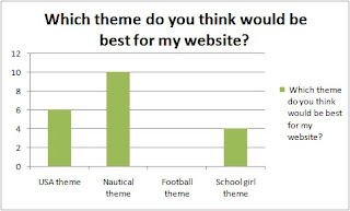
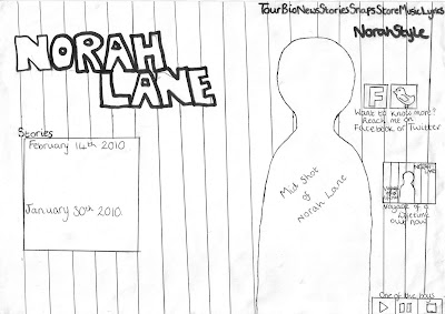
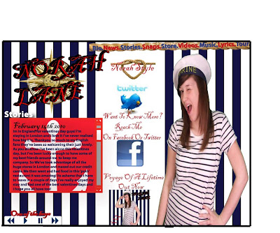
  Looking at the results most people think that Norah’s website is realistic comparing it with other Tween pop artists as only 4 people have scored it below a 7. This could be because we have chosen a nautical theme as 22 out of 25 people said yes they like the theme chosen for the website. The majority of the girls that I asked also believed that the nautical theme also suits Norah’s personality from her music video with 20 out of 15 saying yes. Although when I asked if they thought the website is easy to understand and navigate around only 14 out of 25 said that it was, meaning that quite a few people thought that it wasn’t very clear.
  When I asked the girls if they thought there was enough information available for fans looking at the features available on the website 22 out of 25 said yes that there was. Those who said no thought that there wasn’t enough information on Norah Lane just looking at the homepage. Alternatively there is NorahStyle on the homepage for the bigger fans to become members to get exclusive information about Norah and 19 out of the 25 girls said that they would like to become a member themselves.
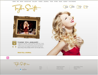
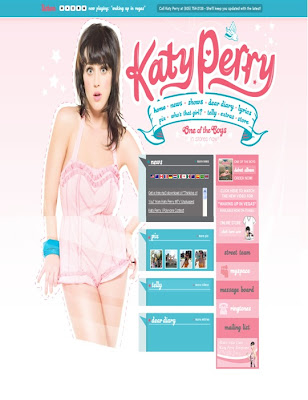
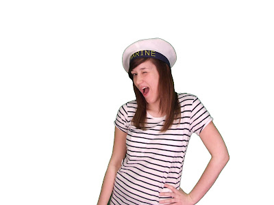
  More importantly 17 out of 25 girls thought that the image isn’t appropriate for the website as she is winking at the camera which may look slightly promiscuous to young girls and parents. So although we used this after looking at Katy Perry’s website it may be something we need to change. However a good outcome was that 20 out of 25 girls said that they thought the website would appeal to them and only five of the girls mentioned that we needed to make improvements. The only improvements that they believe we need to make are to change the image to something more suitable and to make the text a bit clearer.
  Comparing our Album cover to other Tween pop artists people generally scored high with none of the girls scoring below 5 and most people scoring 8 to 10, suggesting that it looks professional. The girls also thought it was a good idea that we used the same theme for our website and album cover as 24 out of 25 said yes. Having Norah Lane dressed in the same clothes as her website on her album was successful as 24 out of the 25 girls thought that it was a good addition, as well as 23 girls believed that the image used for the back of the album cover works well with the nautical theme.
  The girls seemed to like the presentation on the album cover as 18 out of 25 said that they would even buy it if they saw it in stores. All 25 of the girls thought that the album title is suitable and 23 out of the 25 girls thought that the songs on the album looked like those you would see on a typical Tween pop artist’s album. Only two of the girls could come up with improvements for the album cover and this was that they noticed there wasn’t any small print on the bottom of the back cover as there is on other albums.
  On the whole people thought that the way we have given Norah Lane a good representation with only 7 people thinking other. People may not believe that she has been given a good representation due to the image used on her website as a lot of people seemed to object to it. However, overall Norah Lane would be a suitable icon for young girls as a Tween pop artist.
  20 out 25 of the girls like Norah Lane as an artist and said that they would chose to follow her. Reasons that they gave for this were mainly that she sings the genre of music that they prefer or that Norah looks like your typical Tween pop artists. Other reasons included that they like the album and that the song titles looked like something that they’d want to listen to. A lot of people also said that they like the music video and it is something that would interest them. However those who answered no generally thought that Norah isn’t as good as other Tween pop artists out there and the music video didn’t measure up to the love story used in Taylor Swift’s you belong with me, which is a hard thing to do when it has won so many awards. All in all I think that our potential target audience have a mixture of feelings about our media products but the majority of people tend to like our music video and the artist that we have created. A lot of people are enthusiastic about our album cover and our website but our downfall was the image used for the webpage which the girls didn’t seem to like.
